
Last Updated: November 15, 2026
Quick Summary
Clear communication of brand identity through visual storytelling for corporate law means using consistent colors, typefaces, and photography to show what a firm stands for before a single conversation happens. Strong corporate law branding looks steady and human, not flashy, so general counsel trust the firm with difficult matters.
- Pick one anchor color and one accent, keeping roughly 90 percent neutral and 10 percent brand color.
- Set body text at 16 pixels or larger with line spacing around 1.5 for readability.
- Write down a photography style: natural light, unposed expressions, real offices, no stock gavels.
- Keep visual brand guidelines under ten pages, with a one-page summary at the front.
- Run every image through consent, confidentiality, and advertising checks before it goes public.
Table of Contents
- Why Visual Storytelling Matters for Corporate Law Brand Identity
- The Building Blocks of a Law Firm’s Visual Identity
- Law Firm Brand Identity Examples You Can Learn From
- Law Firm Photography Ideas That Build Trust
- Choosing Law Firm Website Imagery That Works
- Creating Visual Brand Guidelines for Law Firms
- Ethics and Confidentiality in Legal Visual Content
- A Repeatable Workflow for Producing Brand Imagery
- Measuring Whether Your Visual Story Is Working
- Book Your Photography Session
- Frequently Asked Questions
Why Visual Storytelling Matters for Corporate Law Brand Identity
Clients hire lawyers before they know whether the work is any good. That gap is where brand identity does its heavy lifting. Clear communication of brand identity through visual storytelling for corporate law means using images, video, and design choices to show what a firm stands for before a single conversation happens. (Source: Understanding Success Criterion 1.4.3: Contrast (Minimum) | WAI)
Corporate law branding is not about looking impressive. It is about looking like the kind of firm a general counsel would trust with a difficult matter. A logo alone cannot do that. A coherent visual story can.
How Storytelling Shapes Brand Perception
Perception forms fast. A visitor lands on your site, scans the team page, and decides in seconds whether your firm feels steady or scattered. Brand storytelling works because people remember stories better than service lists.
Three things drive that perception:
- Consistency. The same colors, tone, and photo style across every page signals order.
- Human faces. A real attorney looking relaxed reads as approachable. A stock photo reads as filler.
- Specificity. Photos of your actual office and team say “this place exists” in a way no tagline can.
Get those right and your brand narrative starts doing pre-sales work for you.
The Building Blocks of a Law Firm’s Visual Identity
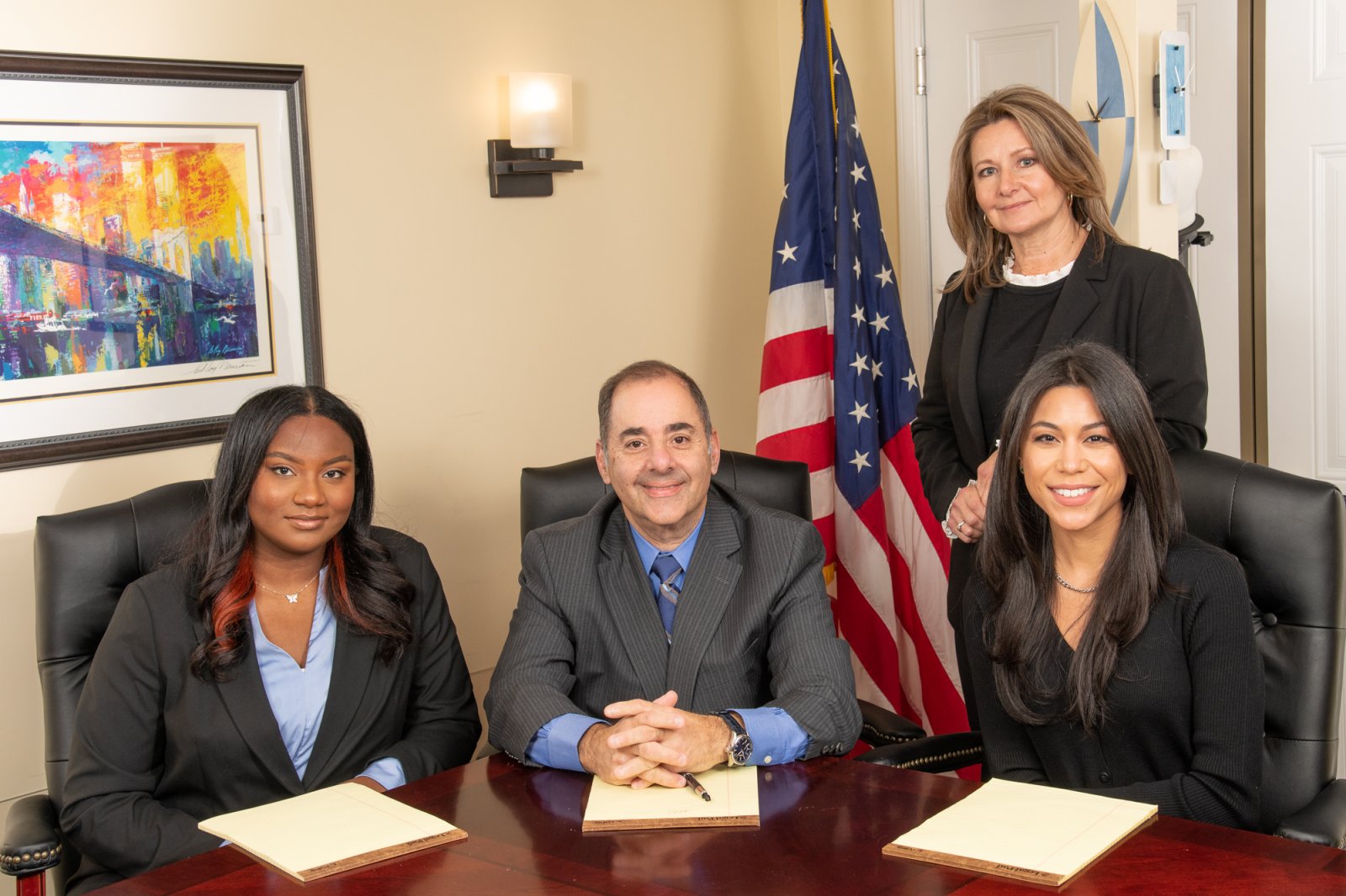
A visual identity is the fixed set of design decisions a firm applies to everything it publishes. That includes a primary and secondary color palette, two typefaces, a logo with clear spacing rules, and a defined photography style. Together these create brand recognition the moment someone opens a document or a web page.
For corporate law, each building block should do a job beyond looking nice. General counsel and business decision-makers are scanning for signals of judgment, steadiness, and service. Your visual system should send those signals on purpose, not by accident.
Color: Signal Stability, Not Excitement
Pick one anchor color and one accent. Deep navy, charcoal, forest green, and burgundy read as steady and institutional. Bright orange or neon pink can work for a consumer brand, but in a corporate law context they tend to read as a startup pitch deck. That is fine if you are positioning as a legal-tech disruptor and not fine if you are pitching to a Fortune 500 procurement team.
Use the anchor color for headers, navigation, and document rules. Use the accent sparingly, for links, buttons, and one highlight per page. A common pattern is roughly 90 percent neutral (white, off-white, gray) and 10 percent brand color. That ratio keeps dense legal content readable.
Watch out: low-contrast gray-on-gray text looks elegant in a mockup and fails accessibility checks in production. Aim for a contrast ratio of at least 4.5:1 for body text, which is the WCAG AA threshold most web teams follow (Understanding Success Criterion 1.4.3: Contrast (Minimum) | WAI).
Typography: Readability Beats Personality
Choose one serif or sans-serif for body text and one heading font. That is it. Corporate law readers spend time with long documents, so body text should be set at 16 pixels or larger on screen with generous line spacing (around 1.5). Headings can carry more personality, but keep them to two weights.
A practical pairing many firms use: a clean sans-serif for body and a slightly more formal serif for headings, or the reverse. Avoid script fonts, all-caps body text, and more than two typefaces across the whole system. Every extra font is a decision someone on your team will eventually get wrong.
Photography: Show Judgment and Approachability

A stated photography style is the piece most firms skip. Write it down: natural light, unposed expressions, real offices, no heavy filters, no stock imagery of gavels or scales. The goal is to show real attorneys who look calm and competent, plus environmental shots that prove the firm is a working place.
Define three shot types in your guide:
- Portrait: head-and-shoulders, neutral background, relaxed expression
- Environmental: attorney at a desk, in a conference room, or walking a hallway
- Detail: hands on a document, a notebook, a doorway, small cues that suggest work in progress without showing client material
Templates: Where Consistency Actually Lives
Templates are the quiet workhorse of a visual identity. Set up letterhead, a proposal cover, a PowerPoint master, social post frames, and an email signature block. When these are locked, a partner can produce a client-ready document without thinking about design, and the firm still looks like one firm.
A simple test: hand a new associate a template and a paragraph of text. If they can produce something on-brand in ten minutes, the system works. If they have to ask which font to use, the guide needs another page.
Write these decisions down once and the guesswork disappears. For teams that want a unified look across every office, corporate headshots that keep your team visually connected show how consistent standards work in practice.
Law Firm Brand Identity Examples You Can Learn From
The strongest legal brands share a pattern: they pick one visual idea and repeat it without apology. A litigation boutique might use high-contrast black-and-white portraits to signal seriousness. A transactional firm might favor warm, bright office scenes to signal collaboration.
What separates these examples from weaker ones is restraint. They do not mix five photo styles. They do not swap logos every quarter. Brand consistency is the whole strategy.
If you want to study what strong personal branding looks like in practice, browse professional headshot examples that work for business and notice how little the best ones rely on props. The face carries the message.
Law Firm Photography Ideas That Build Trust
Trust in legal services is visual before it is verbal. The photography that builds it has one job: prove there are real, calm, competent people behind the letterhead. That rules out stiff poses and heavy retouching.

Headshots That Look Like a Real Person
A good attorney headshot looks like the person, not a polished version of them. Personal branding photography can make attorneys look approachable and trustworthy. Natural expressions, soft lighting, and minimal editing do more for credibility than any backdrop. This is where most firms go wrong: they choose the most formal frame instead of the most human one.
HeadShot Rescue offers creative direction and planning based on business goals and image placement, with a focus on natural, non-stiff imagery.

Images From the Office and Beyond
Environmental photos round out the story. A conference room mid-meeting, a hallway, a handshake at a doorway: these show the firm as a working place. HeadShot Rescue offers both studio and on-location photography options. (Source: American Bar Association’s guidance on professional conduct)
Choosing Law Firm Website Imagery That Works
Website imagery should answer three questions in order: who works here, what do they do, and can I picture myself calling them. If a photo does not serve one of those, cut it.
A quick test for any image on your site:
- Is the person identifiable as part of your team?
- Does the lighting and tone match the rest of the site?
- Would a client recognize this as your firm without the logo?
- Is the file compressed and properly sized for fast loading?
To judge what style fits your site, review a portfolio of professional photography and compare it against your current pages.
Creating Visual Brand Guidelines for Law Firms
Visual brand guidelines for law firms are a short document that tells anyone publishing on the firm’s behalf which colors, fonts, and photo styles to use. Keep it under ten pages. Long guidelines get ignored.
Include these sections:
- Logo usage: minimum size, clear space, approved backgrounds
- Color values: exact codes for print and screen
- Typography: heading and body fonts with size rules
- Photography style: what to shoot, what to avoid, sample images
- Do-not list: stretched logos, filters, mismatched stock photos
A one-page summary at the front helps busy partners apply it without reading the whole thing.
Ethics and Confidentiality in Legal Visual Content
Legal marketing carries obligations that most industries never face. Attorney advertising rules and client confidentiality mean every image needs a second look before it goes public. This is the section competitors skip, and it is the one that keeps a firm out of trouble.
The Rules That Apply
Two practical consequences for visual content:
- No false or misleading statements. A photo that implies a practice area, office, or result the firm does not actually have can count as misleading.
- Substantiation. If a visual implies a claim (for example, a chart suggesting case outcomes), the firm should be able to back it up.
Testimonials and client names get extra scrutiny in many states. Some require disclaimers, some restrict the use of client names in ads, and some treat a video testimonial as a formal advertisement. Check your state bar’s rules before publishing any client-facing video or quote.
Confidentiality: The Visual Version
Attorney-client confidentiality does not stop at the written word. A candid photo taken at a client event can reveal a representation the client never agreed to publicize. A whiteboard in the background of an office shot can show a matter name. A screen reflection can show an email subject line.
The practical rules we recommend:
- Get signed releases for every identifiable person, including staff, clients, and guests
- Never photograph case files, whiteboards, monitors, or sticky notes with client names
- Do a background sweep before every shot, look at the wall behind the subject, not just the subject
- Confirm usage rights in writing before a shoot, including whether images can be used in paid ads
- Keep a simple log of what was approved, by whom, and when
Watch out: a release that covers a website bio may not cover a paid LinkedIn campaign. Spell out the intended uses in the release itself, or get a fresh one when the use changes.
A Simple Approval Workflow
Before any image goes public, run it through three checks:
- Consent check. Is every identifiable person covered by a signed release for this specific use?
- Confidentiality check. Does the image show any client name, matter, document, or screen?
- Advertising check. Does the image, caption, or surrounding copy make a claim the firm cannot substantiate, or run afoul of state bar rules on testimonials?
For firms subject to state bar advertising rules, have counsel review the final image set before launch. The American Bar Association’s guidance on lawyer advertising is a reasonable starting point, and your state bar’s own rules control. Keep the approval log with the shoot files so next year’s team knows what was cleared and what was not.
A Repeatable Workflow for Producing Brand Imagery
A repeatable workflow keeps visual identity from drifting. Ours runs in five steps, and it works for a five-person firm as well as a fifty-person one.
|
Step |
What Happens |
Who Owns It |
|---|---|---|
|
1. Plan |
Define goals, placements, and image count |
Marketing lead |
|
2. Brief |
Share the style guide and shot list with the photographer |
Marketing lead |
|
3. Shoot |
Capture headshots plus environmental and detail shots |
Photographer |
|
4. Select |
Choose finals against the style guide, not personal taste |
Marketing lead |
|
5. Distribute |
Load into a shared library with usage notes |
Marketing lead |
Two habits make this stick. First, treat every location change as a new decision and re-verify it. Second, keep a log of past shoots, agreements, and outcomes so next year’s planning starts from facts.
Measuring Whether Your Visual Story Is Working
Track these:
- Engagement on team pages: time on page and scroll depth
- Profile consistency: how many staff have updated portraits in use
- Inbound quality: whether new inquiries mention the website or a specific attorney
- Recall: ask new clients in intake whether they remember a photo
None of these prove causation alone. Together they show direction, which is enough to justify the next shoot.
Book Your Photography Session
The hardest part of corporate law branding is not choosing colors. It is getting a room full of busy attorneys to sit for portraits that actually look like them. That is the problem we solve.
HeadShot Rescue brings experienced creative direction to every session, with studio and on-location options and planning built around where your images will appear. We focus on natural, non-stiff portraits, and we tailor the style to your firm rather than applying one house look. With 500+ clients and 30+ years of experience behind us, we know how to make professional images feel credible.
Get started with HeadShot Rescue and give your firm a visual identity that clients trust on sight. Reach out through our contact page to schedule your session.
Your firm’s expertise deserves to be seen, not guessed at. HeadShot Rescue plans each session around your goals, shoots in-studio or on location, and delivers natural portraits built for your website and marketing. Get started with HeadShot Rescue and put a real face on your firm.
Frequently Asked Questions
How can a corporate law firm use visual storytelling?
Start with a clear brand narrative, then choose photos that match it. Use real attorney headshots, office scenes, and client-centered images instead of generic stock photos. Keep colors, lighting, and tone consistent across your website, LinkedIn, and printed materials. The goal is a visual story that says who you are and why clients should trust you, so every image should support that message rather than just fill space.
What images help communicate a law firm’s brand identity?
Authentic headshots of your attorneys top the list, because clients want to see who they will work with. Add photos of your team in meetings, your office environment, and community events. Avoid stiff, over-edited portraits and generic gavel-and-scales stock images. When your photos look natural and consistent, they reinforce your brand personality and make your firm feel approachable and credible at the same time.
How do you keep law firm photography consistent across marketing channels?
Write visual brand guidelines that cover lighting, background, wardrobe, and editing style. Give your photographer those guidelines before every shoot. Use the same headshot style on your website, LinkedIn, and directories so clients recognize your attorneys everywhere. Review new images against the guidelines before publishing, and refresh older photos so the whole set keeps one consistent look.
What are the four pillars of brand storytelling?
Most frameworks point to four elements: a clear message, a relatable character (your attorneys and clients), a conflict or challenge the audience faces, and a resolution your firm provides. For a law firm, that means showing the problem clients bring you, the people who solve it, and the outcome. Strong visuals support each pillar, from portraits that show personality to images that illustrate your working process.
Can we use client photos or case details in our marketing?
Only with written permission, and only in ways that follow your state bar’s advertising rules on confidentiality and testimonials. Get a signed release before using any client image, and avoid revealing case details that could identify someone. When in doubt, use staff photos, office scenes, or illustrative images instead. Check your state bar’s guidance on attorney advertising before publishing anything that references a real matter.